Completed
University of Chicago
Developing ML Models/Advanced Visualizations to Analyze NY State Taxi Data & Create Predictive Algorithms
A final project for UChicago's "Pathways in Data Science" summer program. Includes a complete analysis for New York taxi datasets, utilizing advanced visualizations and machine learning models via Python, listed:
- Price estimation algorithm (kNR, linear regression models)
- Interactive geographical heatmap + video timelapse
- Matplotlib visualizations depicting change over time
TIMELINE
FIELD
2026
Data Science
ROLE
Team Member
STATUS
Completed
PROJECT OVERVIEW
INTRODUCTION
RESEARCH QUESTIONS AND ADAPTATIONS
When first presented with the dataset, two central questions emerged: How can we optimize transportation within taxi agencies, and how can we improve accessibility for users? Through an analytical lens, we questioned what insights could be extracted and presented meaningfully. How could we visualize traffic flow throughout the day? How did such patterns change over years, and why? We also questioned how to extend accessibility further by creating interactive models. Was there a way to estimate taxi prices by making predictions for individual fare components? Later in the process, new questions arose––after plotting fare per mile by year, we wondered: can we model the number of taxis per hour?
As we continued working, we realized that some of our initial questions were impractical. For one, we discovered that it would be far too difficult to model every variable affecting fare prices. We attempted logistic regressions and random forest classifiers, each increasing complexity unnecessarily. Representing change over years presented complications when full datasets took up too much memory. We dealt with these issues by calculating prices in a more direct manner and sampling data.
With such questions in mind, we developed our project, the process of which is further described below.
DATA STRUCTURE
Data was collected from provided datasets available on the TLC Trip Record Data page as parquet archives. The sets included features like dates (month, day, hour), location of pick-up and drop-off, trip distance, passenger count, and a variety of columns relating to price broken down (fare, tolls, surcharges, and tips). We found the number of trips particularly useful for analysis.
To expand, we downloaded datasets for May of previous years. We chose data from 2011 to the present for consistent formatting. Due to memory limitations of runtime, we were only able to analyze data by skipping every 3 years up to 2026, using simple random sampling to collect 200,000 rows from each to minimize bias.
FILTERING
The datasets contained millions of values, many of which required filtering to remove noise and erroneous values. Firstly, rows with null values/rate code IDs were removed, as they led to unexpected spikes in price or duration ($1000+ or >24hrs). Trips of negative or unfeasible lengths (305mi - greater than the diameter of New York) were removed. Finally, trips with unreasonable speeds (<2mph average) or ones that reflected months other than May were removed. The same filtering process was applied to every dataset.

ANALYSIS
We made several visualizations of numerical columns that we felt would be significant in impacting the fare.

We noticed that the fare amount varied by trip distance with a positive correlation. Trip distance could therefore be a good predictor of fare.
The trip distance funnels outward with the time elapsed, still in a relatively positive correlation. However, due to variation in the data, we believed that the trip distance was not an appropriate predictor.
To answer questions about price changes over time, we made a visualization representing the fare (dollars/mile) for each hour in the day across many years. We observed that there was a noticeable increase in pricing after 2020, which could be attributed to the COVID-19 pandemic.

Seeing the differences in pricing throughout the day led us to question frequency as well––at what time is there the most demand for taxis? We found that demand consistently peaked around 8:00am and declined around 6:00pm. This is consistent with regular working hours.

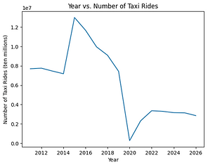
We decided to further explore the sudden spike in prices after COVID, and found potential answers in our visualization depicting the year vs. number of taxi rides. Taxi usage was already on a steady decline after 2015, a drop that was accelerated when COVID hit around late 2019. This aligns with an analysis of both the pandemic and competition––in 2017, Uber stated on their website that they were labeled as the go-to ride for around 72% of New Yorkers after a spike in popularity (Uber, 2017). When the pandemic added to this decline, it was only reasonable that fares saw a noticeable jump.
FARE PREDICTOR
Our fare predictor is based on the most recent data, May of 2026, as we want to adapt to the latest rate trends. As established earlier, fare price is highly correlated with trip distance; however, we cannot get this upfront from a user interested in predicting their fare. We determined that the pick-up and drop-off location IDs could be predictor variables for trip distance.

We opted to use a K-Neighbors Regressor (kNR) model, a supervised learning model that predicts outputs based on data proximity. This matched with our problem, since trips with similar pick-up and drop-off locations would have similar travel distances. Originally, the Hamming distance metric was used as it is designed for categorical features such as the location ID. However, due to computation speed (Hamming is ~100x slower) and minimal accuracy gain, we switched to Euclidean distance. This is still meaningful, as districts are labelled with ID based on geographic distance: locations 10 and 11 are guaranteed to be geographically closer than 10 and 200.
The model was trained using the PULocationID and DOLocationID columns as predictors and the recorded trip distance as the outcome. We then evaluated accuracy and RMSE with several k values, selecting k=5 for a balanced prediction that accounts for potential noise in the data. This model for trip distance achieved an RMSE of 1.52 miles and an R² of 0.88.
The trip distance is then passed into a linear regression model that takes in a trip distance as a predictor and outputs the fare amount. This model achieved an RMSE of $6.30 and an R² of 0.88. Additionally, the residual histogram is relatively bell-shaped and predicted values are scattered, showing a linear model is appropriate.
Combining both models into a pipeline allowed us to estimate fares using only a pick-up and drop-off location.
This model provided an acceptable error—across 20% of randomly sampled data, the model achieved a mean absolute error of $4.60 and mean absolute percentage error of 28.25%, meaning fare estimates were off by an average of $4.60 per trip. While not perfectly accurate, the model provides reasonably close fare estimates for many trips.

GEOGRAPHICAL HEATMAP
Please click HERE to view our geographical heatmap timelapse (YouTube video)
The geographical heatmap functions and videos demonstrate variable relations within locations. The visualization process includes three stages: data import and processing, heatmap rendering, and video
generation. The example video is generated via this pipeline, featuring the visualization of population flow of NYC taxis in May 2026.
First, the 2D geometry of the target location is imported by ID for sequential drawing on the map. Then, the columns are analyzed by grouping and applying an aggregate function.
The data is then passed into the heat map drawing function, with parameters of flow-in values, flow-out values, region selections, date/hour selection, and a general sum of all population flow for all days of the month.

DISCUSSION/RESULTS
Our visualizations demonstrate general trends about taxi services in New York over the past 15 years. Generally, taxi usage has declined due to the introduction of new ridesharing services and the global pandemic in late 2019, which decreased demand for outdoor transportation. To help compensate for a lack of activity and rising prices, taxis can gain customer trust by implementing our price estimator.
The heatmap displays helpful information about user location––when vacant, taxis can gravitate towards Manhattan, which sees consistent flow in and out throughout the day, or the JFK airport, which has highest taxi demand between 3:00-10:00pm. Specifically, in Manhattan, Penn Station at Madison Sq West (region 186) sees consistent population flow out, which is a useful center of interest. Moreover, the Newark airport sees high flow in, but very little flow out, which may indicate a lack of service––worth looking into.
In this sense, we were able to address our initial questions about traffic flow and change over time. We also addressed our pricing concerns for the agency and user alike.
Assumptions made within modeling include potentially biased filtering, such as limiting average trip speed and duration (<2mph, <1 min), and sample diversity concerns for our 200,000-data-point simple random sampling.
Future research for this topic could include experimentation with other models for more accurate fare prediction, such as Random Forest or Cat Boost Regressors. Additionally, more data can be included, such as longitude and latitude, and improved filtering techniques can be employed for enhanced models.
GROUP CONTRIBUTIONS
SECIL
ERIC
ALAN
-
Wrote price calculation and filtration functions
-
Created original logistic regression model for surcharge calculations
-
Created the change over time graphs
-
Contributed to report – introduction, initial questions, external research, exploratory and final analysis
-
Created heatmap graphs and timelapse
-
Contributed to report – geographical heatmap functions/videos
-
Sampled and parsed data separately
-
Created kNR model to predict distance
-
Neatened and optimized code and visualizations
-
Contributed to report – data filtration, exploratory analysis, modeling